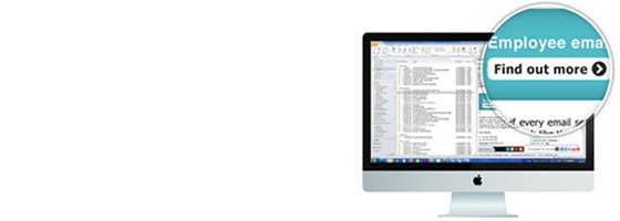
Email media allows you to send sales and marketing messages on your everyday email communications. It is important that the designs you use in email media are fulfilling your requirements, whether that be consistency of branding or encouraging click throughs to direct bookings.
Step 1- Clarify your objectives, what are you trying to achieve?
The first point to decide upon is the objective of your email banner. What are you trying to achieve? How you will measure your results and show ROI? For example, if you want brand consistency then you may only want to know that all your emails are being branded correctly, or, for online sales you need to consider whether you can use a web tracking tool to follow through from initial click to online booking (such as Omniture or TagMan).
What are your aims and objectives? Here are 7 common goals for email media.
- Drive web traffic
- Increase lead generation and sales
- Integrate social media
- Achieve brand consistency
- Build your database
- Make your email mobile
- Manage your online reputation
Once your objective is clarified it is easier to define your call to action.
Step 2- Targeting- who is your audience?
Each email recipient is different, not just in their requirements from your business, but the way they look at your email media.
Some will have a natural inclination to click on images within your email, whereas others will not. It seems self-explanatory but always try to include a specific call to action on your banner. ‘Click to find out more’ or use of an arrow seems basic but it can help ensure your customers actually do what you want them to do – click!
Step 3- Technology – take advantage of email media’s full functionality
Remember you can use image mapping on your email media images. A banner doesn’t have to click to just one place. Use the opportunity to cross and upsell your business services. Incorporate tabs or buttons in your design to take your recipients to other areas of your website. Create links to documents, videos, social media, voucher downloads, newsletter sign-up or even the app store.
Did you know your banner doesn’t have to just click through to a URL, but it can also click to an email address with a pre-defined subject line?
Consider doing A/B testing on banners. Have 2 design variations for the same sales and marketing message to see which gets the most clicks. Use this information to run only the most successful design, and consider why it achieved higher click through rates for when you do your next brief.
Learn from your past banners and make your next ones better!

